Mobile PlantDiagnosis Mockup
A mobile-first plant diagnosis experience designed to make identifying plant problems simple, accessible, and intuitive.
Project
Plantosis
Focus
UX / UI Design
Platform
Mobile First
Tools
Figma / Prototyping
01 — Overview
Designing for a quick answer
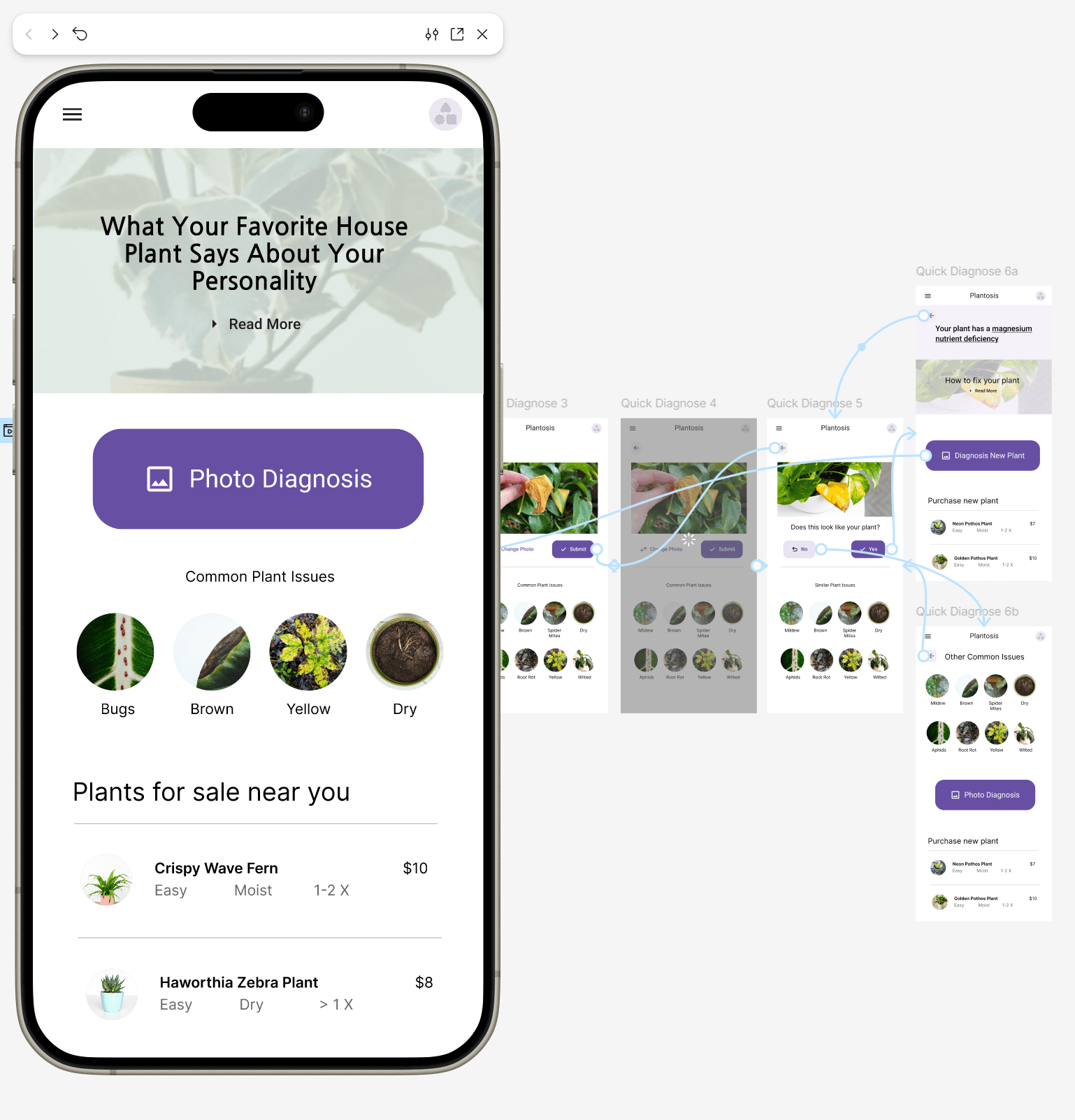
I designed this experience as a mobile-first solution for people who want to quickly understand what is wrong with their house plants.
The central concept was simple: allow a user to take or upload a photo of a plant, identify a potential issue, and receive useful recommendations without navigating through a complicated interface.
The Challenge
Plant problems are easy to see. Diagnosing them isn't.
Plant owners often know that something is wrong without knowing exactly what the problem is. The experience needed to reduce that uncertainty while keeping the interaction simple enough for a first-time user.
Core UX question
How can we turn a potentially complicated diagnosis process into a simple, photo-driven experience?
02 — Design Process
From concept to experience
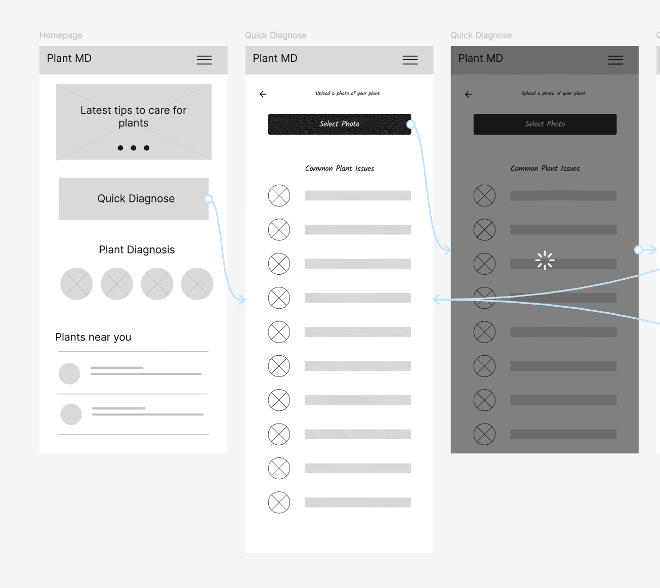
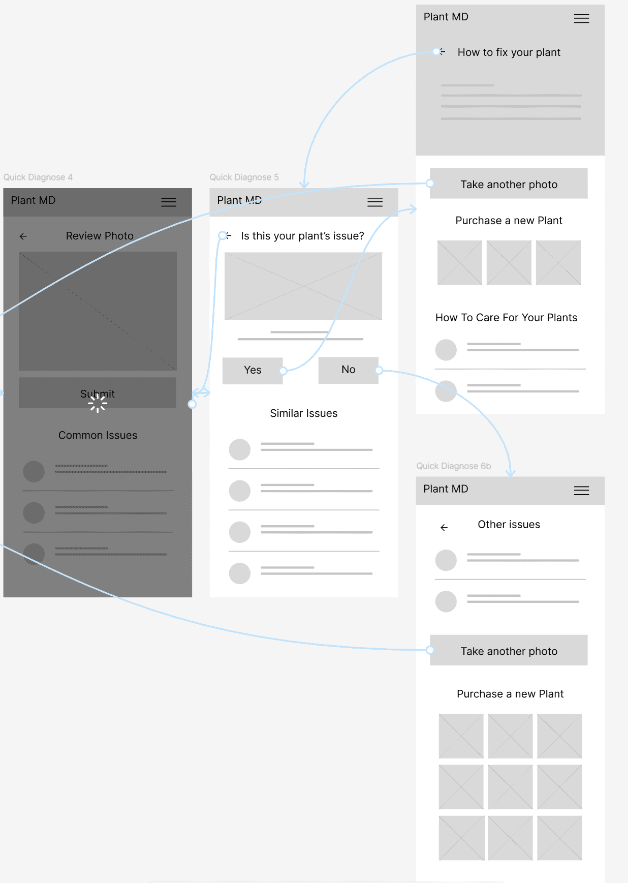
The project evolved through several rounds of exploration, refinement, and usability improvements.
Discover
Defined the user problem and explored how plant owners might interact with a diagnosis tool.
Prototype
Created initial mobile concepts and prototypes in Figma.
Test
Evaluated the experience and identified areas where navigation could be simplified.
Iterate
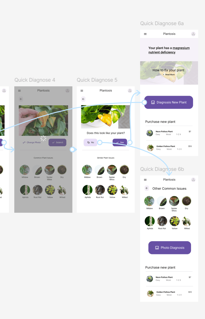
Refined the user flow, navigation, and photo diagnosis experience.
03 — Discovery
Understanding Scope
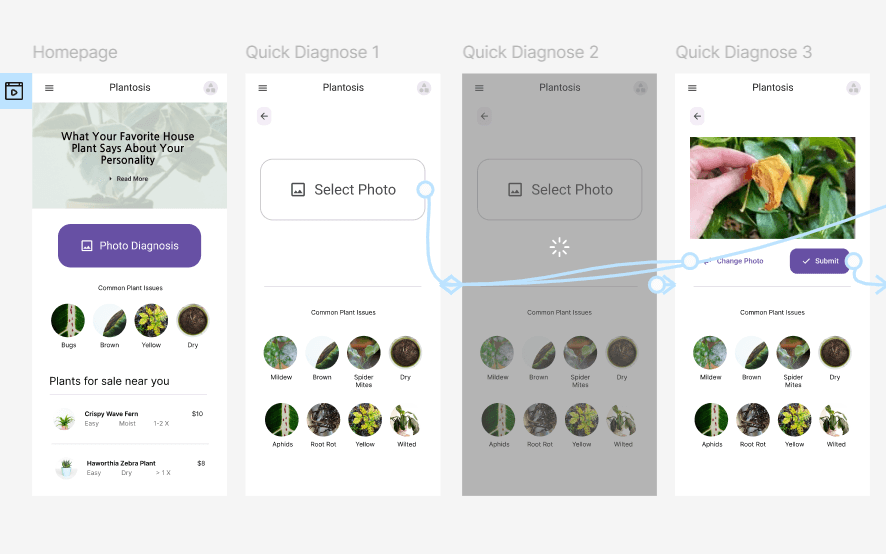
The project was designed and prototyped in Figma with a strong emphasis on user-first design.
Rather than overwhelming users with information, the interface was structured around one primary action: identifying the plant problem.
04 — Design Direction
Designing around the user
Photo First
Make uploading a plant image the clearest and easiest action on the page.
Simple Navigation
Reduce unnecessary decisions and make it obvious how users move forward or return.
Actionable Results
Diagnosis should lead naturally into useful recommendations and next steps.
05 — Design Direction
Narrowing Focus
After the initial concepts, the experience became centered around the photo upload.
This created a much clearer interaction model: upload a plant, identify the issue, and discover what to do next.
UX takeaway
One primary action can dramatically simplify the first-use experience.
06 — Product Strategy
Being Realistic
The concept was designed to work beyond the initial diagnosis feature.
Educational blog content could bring users into the experience, while recommendations and a potential plant resale shop could create a monetization path.
Mobile
Primary experience
Simple
Core interaction
07 — UX Improvements
Increasing Usability
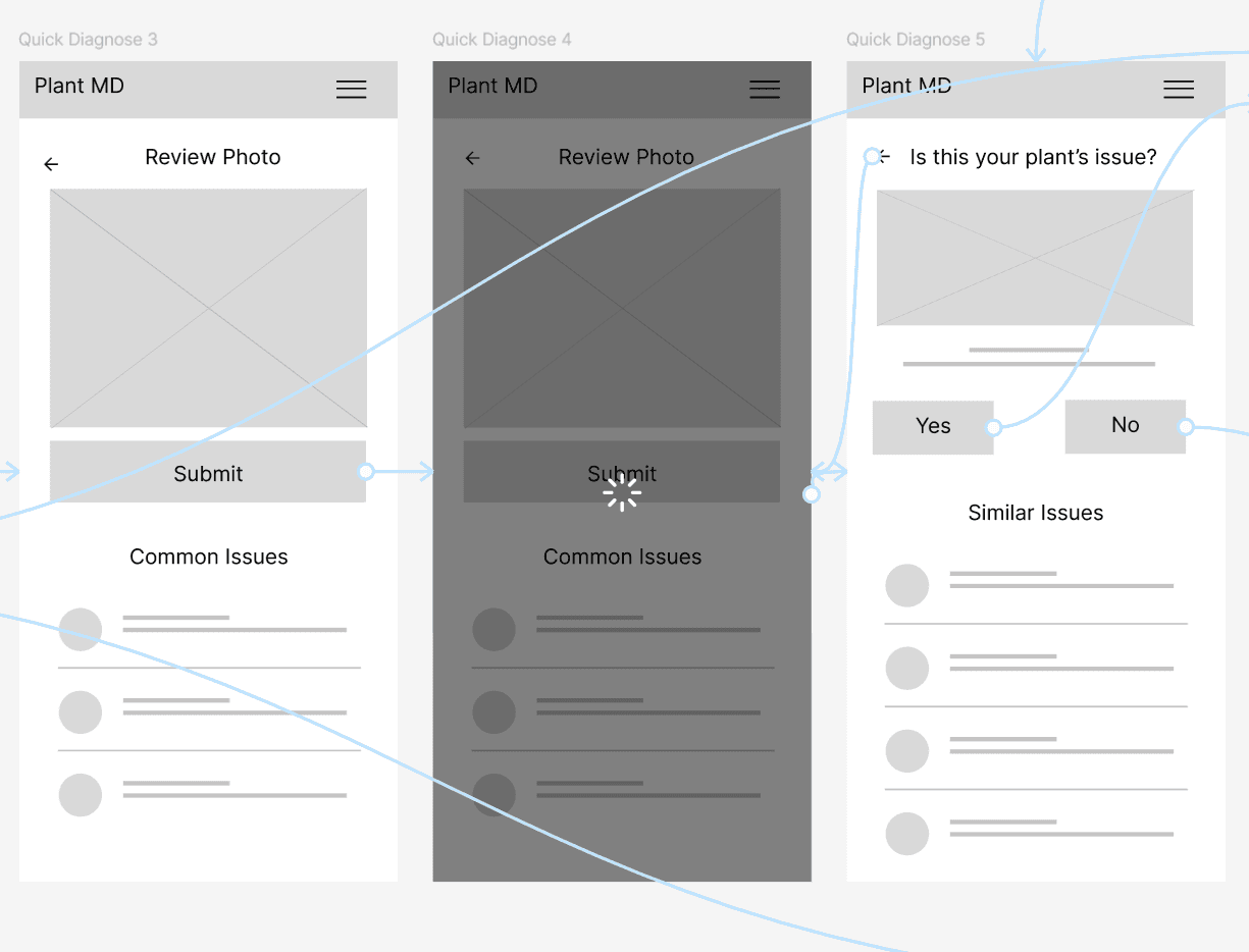
The Photo Diagnosis feature needed to feel effortless.
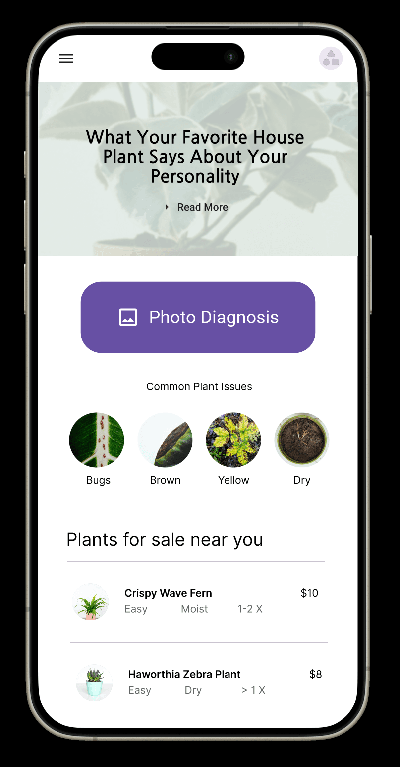
Testing and feedback led to additional back buttons, clearer redirects, and improved movement between screens.
- ✓Clearer navigation
- ✓Easier return paths
- ✓Simplified photo workflow
08 — Iteration
Continuing Iterations
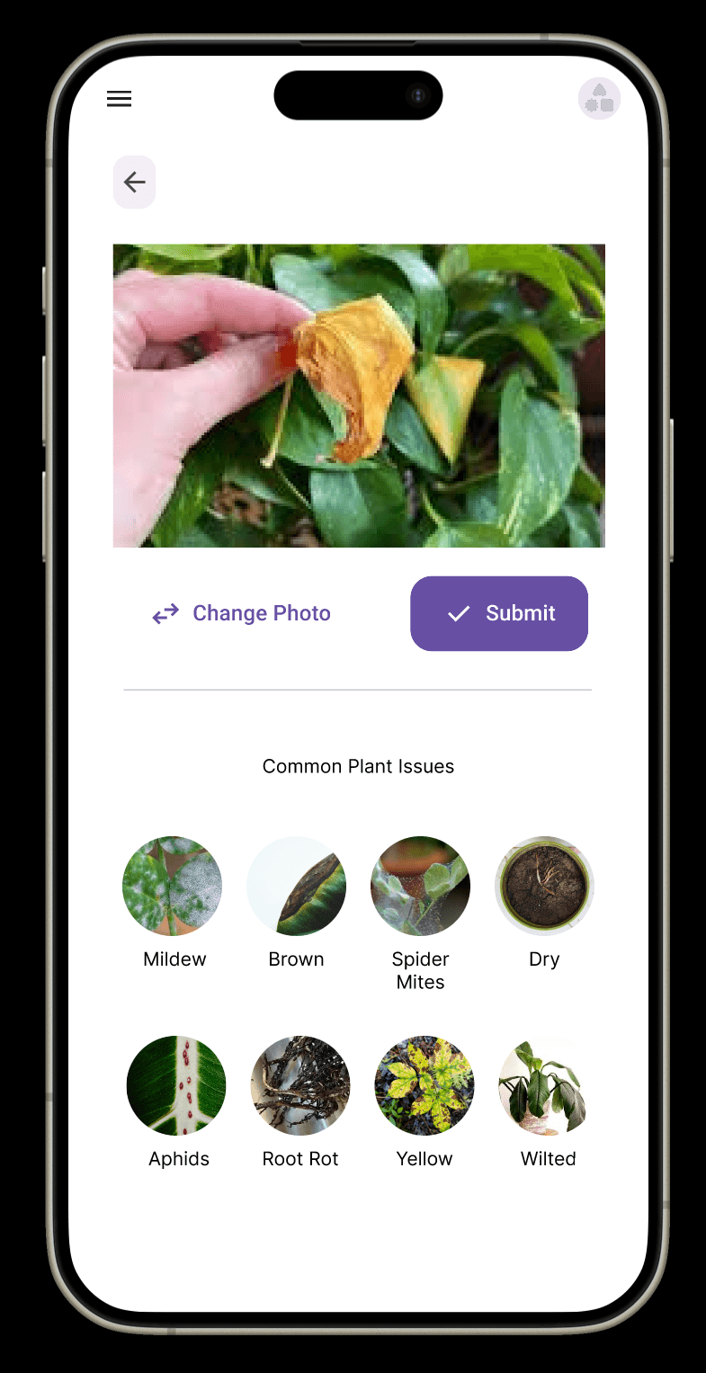
The project continued to evolve through changes to content, imagery, and user flows.
While the original concept began as a mockup, the process revealed opportunities for a real mobile-first plant experience centered around quick diagnosis and actionable recommendations.
09 — Takeaways
Moving Forward
The project established a strong foundation, but several areas could make the experience even stronger.
User Onboarding
Introduce new users to the diagnosis process and clearly explain what happens after uploading a photo.
Further Customization
Add additional tools, recommendations, and plant information to increase long-term usefulness.
Mobile Navigation
A persistent bottom navigation could make the experience feel even more like a native mobile application.
Your business deserves
a better website.
Let's build a digital experience that represents your brand, reaches your audience, and helps your business grow.